Madrid definitely has an eclectic mix of architecture, as I've already posted a few examples of (lizard and wedding cake buildings, most ostentatious belle epoque, and Herzog and de Meuron's masterpiece). You can really get a feel for the history of Spain, just by walking around and observing different architectural influences over the centuries. Unfortunately, few examples remain of the rich mudéjar style developed by the Moors that I lavished in on my trip to Andalucía. Some of the only reminders of the Muslim origins of Madrid are the remaining pieces of the Muralla Árabe (Arab Wall).
There are some fascinating and seemingly forgotten old buildings if you can find them, tucked away next to sober dictatorship-era construction. One of the sites that caught my imagination was this ancient construction, which has been converted into the Biblioteca Escuelas Pías (Pious school library). It's located in Lavapiés, the old Jewish barrio, where there are some sites related to Inquisition history that I will post about next.
And characteristic of Madrid, it's juxtaposed next to this odd urban plaza straight out of a post-Modern dream. By the way, this is not a great neighborhood and I wouldn't recommend walking around here at night, but this is a fascinating area with so much history and worthy of a daytime exploration.
Plaza de la Villa
The intimate Plaza de la Villa on Calle Mayor is one of Madrid's more notable example's of Madrid-style baroque architecture (barroco madrileño), with wonderfully preserved buildings on all three sides. This square was the permanent seat of the Madrid city government from the Middle Ages, until they relocated to the Palacio de Comunicaciones in recent years.
On the eastern side of the square is the 15th century Casa de los Lujanes, a Gothic construction with clear mudéjar influence. The brickwork tower is said to have housed the imprisoned French monarch
Francois I and his sons after the Battle of Pavia in 1525. As the
prisoner was paraded down Calle Mayor, it was said that locals were more
impressed with the lavishly attired Frenchman than his captor the
Spanish Habsburg emperor Carlos I.
This is the really cool and creepy door to the tower - it's on the northern side of the building as you curve around a tiny street that feeds into the plaza.
Is anyone as obsessed as I am with the Google street maps photos option? It lets you see different viewpoints, times, and seasons simultaneously in one place, and it even tries to match the perspective of the photo, creating a new three-dimensional plane for the various contributions. How cool.
Showing posts with label mapping. Show all posts
Friday, April 27, 2012
Wednesday, November 10, 2010
What is all this psychogeographic stuff?
In the hopes of learning through making, I've explored a few possibilities for maps of my own.
This isn't really a map but I wanted to include it anyways because when I started writing this post I was reminded of it. My friend Betsy asked me to contribute to an exquisite corpse project she was working on for the Michael Rock lecture, and this is what I sent (above).
I handed this out for my presentation today - a map of my ideas in a Situationist style. I realized that psychogeography is an umbrella topic for many different things:
a. the personal experience of the street
b. the alternate experience of the street enabled by another person (artist/performer)
c. an artist who aggregates many people's experiences.
The experience can include emotions, atmospheres, encounters with people, play, and letting the contours of geography guide you.
Another topic entirely is the memory map - recording all of the associations you have with a place.
Ok, glad I got that all organized for myself. Here are a few drawings I made with colored pencils based on the symbol exploration (I posted earlier). Using the abstract grid and symbols I recreated my personal experience on Rivington street. So these are memory maps, not psychogeographies. But how can you represent the psychogeography you experience on the street? Through memory, unless there is a way to record it in real time. Oh, video does that. But video doesn't capture the moods, feelings and energy of a place as well as being there. I'm feeling the limitations of all mediums for this idea but I'm prepared to embrace those constraints. I have a relatively interesting idea for my next project, and I'm excited to see where it takes me.
There are three different types of symbols that I used for these: actual symbols, letters that are similar in form to the symbol, then a "free draw" of what I felt represented the symbol. I'm using the word symbol loosely here, and maybe I should look into other word options.
I'm not going to go much in depth about my critique with Bruce Mau last Friday, but the most important thing I learned was to NEVER say the word preservation in association with my thesis. EVER AGAIN.
This isn't really a map but I wanted to include it anyways because when I started writing this post I was reminded of it. My friend Betsy asked me to contribute to an exquisite corpse project she was working on for the Michael Rock lecture, and this is what I sent (above).
I handed this out for my presentation today - a map of my ideas in a Situationist style. I realized that psychogeography is an umbrella topic for many different things:
a. the personal experience of the street
b. the alternate experience of the street enabled by another person (artist/performer)
c. an artist who aggregates many people's experiences.
The experience can include emotions, atmospheres, encounters with people, play, and letting the contours of geography guide you.
Another topic entirely is the memory map - recording all of the associations you have with a place.
Ok, glad I got that all organized for myself. Here are a few drawings I made with colored pencils based on the symbol exploration (I posted earlier). Using the abstract grid and symbols I recreated my personal experience on Rivington street. So these are memory maps, not psychogeographies. But how can you represent the psychogeography you experience on the street? Through memory, unless there is a way to record it in real time. Oh, video does that. But video doesn't capture the moods, feelings and energy of a place as well as being there. I'm feeling the limitations of all mediums for this idea but I'm prepared to embrace those constraints. I have a relatively interesting idea for my next project, and I'm excited to see where it takes me.
There are three different types of symbols that I used for these: actual symbols, letters that are similar in form to the symbol, then a "free draw" of what I felt represented the symbol. I'm using the word symbol loosely here, and maybe I should look into other word options.
I'm not going to go much in depth about my critique with Bruce Mau last Friday, but the most important thing I learned was to NEVER say the word preservation in association with my thesis. EVER AGAIN.
Labels:
abstraction,
drawing,
mapping,
psychogeography
Thursday, November 4, 2010
Continuing on the road to abstraction
I had a great and productive meeting with Michelle Hinebrook today. She's not a thesis advisor but I thought I would benefit from her perspective so I asked her to take a look at what I'm working on. She thought I should feel comfortable to go further into abstraction and be limitless at this point. Every question I'm asking myself at this point is precious because this is the work that will carry me forward into my career. Given the topic I'm on now, I couldn't even cover it in a life's work. There's just that much you can do. The visual explorations of our surroundings are limitless, and my approach has been very open-minded and experimental. She made me realize that I should feel more comfortable showing process and talking about the questions I have.
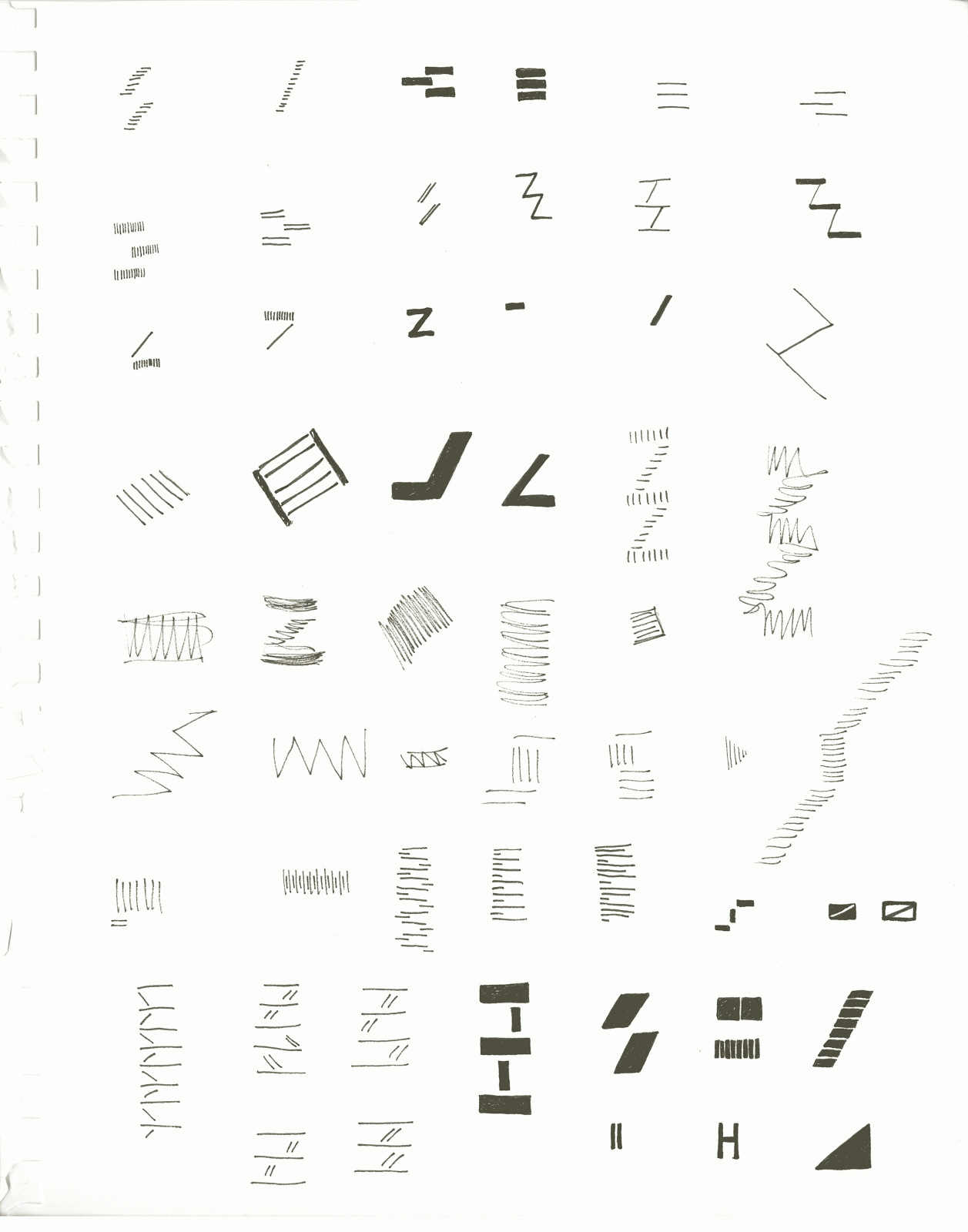
What is my question for Bruce Mau's visit tomorrow? He's coming to give us all a short crit and I've decided to show him some of my process work for thesis. Using my shape abstraction tracings (from a previous post) as a jumping off point, I started sketching a series of symbols to organize the visual language in our surroundings. I'm interested in the legibility of the city and the mental map that lets us remember a place and navigate through it.
I paired the symbols with phrases from Jane Jacobs "The Life and Death of American Cities". I thought the language from the foremost urban planning critic would give the images a new context, bringing into light the neighborhood character that is in constant flux. All of these shapes are images taken on Rivington street.
The next phase was taking these images further into abstraction to get to the absolute simplest form. I still haven't gone far enough into abstraction, so I can do a lot more. This was a really fun process of seeing where the shapes led me, listening to "the yes or no of our material" as Anne Albers said.
Here's my question: I'm working a lot with abstraction, and I'm exploring it's communication value. Do you think complete abstraction communicates in that the viewer can insert themselves into what they are looking at? Richard Tuttle is an example of an artist that works with abstraction of the simplest shapes, and I see cityscapes in them. Someone else might see something else, so in that way does it communicate a message in it's simplicity?
I have abstract maps that I created today as well (need to think of a better word than map), and I will post them tomorrow with the feedback from the crit.
What is my question for Bruce Mau's visit tomorrow? He's coming to give us all a short crit and I've decided to show him some of my process work for thesis. Using my shape abstraction tracings (from a previous post) as a jumping off point, I started sketching a series of symbols to organize the visual language in our surroundings. I'm interested in the legibility of the city and the mental map that lets us remember a place and navigate through it.
I paired the symbols with phrases from Jane Jacobs "The Life and Death of American Cities". I thought the language from the foremost urban planning critic would give the images a new context, bringing into light the neighborhood character that is in constant flux. All of these shapes are images taken on Rivington street.
The next phase was taking these images further into abstraction to get to the absolute simplest form. I still haven't gone far enough into abstraction, so I can do a lot more. This was a really fun process of seeing where the shapes led me, listening to "the yes or no of our material" as Anne Albers said.
Here's my question: I'm working a lot with abstraction, and I'm exploring it's communication value. Do you think complete abstraction communicates in that the viewer can insert themselves into what they are looking at? Richard Tuttle is an example of an artist that works with abstraction of the simplest shapes, and I see cityscapes in them. Someone else might see something else, so in that way does it communicate a message in it's simplicity?
I have abstract maps that I created today as well (need to think of a better word than map), and I will post them tomorrow with the feedback from the crit.
Labels:
abstraction,
drawing,
mapping
Friday, August 6, 2010
Observation drawings


I'm playing with the ideas of observational drawing and recording details of buildings and the inherent patterns in our surroundings. Also I started to create a personal geography of the Lower East side, so I roughly located points of interest in the area and recorded the most interesting detail I remembered from my experience. I worked on more abstract mapping in some paintings - one I included in my previous post.
Next I would like to do some more research on the historical importance of buildings to build more connection to the details, then draw and label them. The more delicate the paper the better, to represent the fragility of memory and physical history that surrounds us. I'm thinking this beautiful rice paper that I have might work.
Monday, August 2, 2010
Saturday, July 10, 2010
The thing is...
In my thesis I don't want to put more printed matter into the universe or send more needless messages. I want to create something of value, that hopefully decreases the high concentration of visual stimuli in our lives. Today I sat and drew a lamp post in the Lower East side, and was so annoyed at the bar across the street for erecting this cheesy sign of photorealistic monkeys (and blasting bad techno). The reason I was so bothered by it is that they had absolutely no awareness of the historical building in which they occupied the street level space, and the architectural details were obviously not considered when hanging this sign, or the other hideous one that reads 'Hungry? $2.95' with a picture of an unappetizing sandwich.
I couldn't bring myself to post the hideous signage from the bar, but this is the building I was admiring. What if there was a way for store signage to connect with the surroundings and incorporate historical detail? For a neighborhood like the Lower East Side with rich history this would add so much value to the area and connect residents and visitors to the place. This idea is related to the theme of localization because using local/historical patterns is parallel to using local materials for building, local food for eating, and local artists for murals. These are all ways to add value to the community and bring awareness to the unique characteristics of the neighborhood.
I could use the inherent patterns and designs on surfaces and from overhead (i.e. Google Earth) to create place-specific artwork (in many forms, one of which would be signage). Actually, this is a photo I took of the restaurant Spitzers across the street from monkey madness. They did a good job of connecting with the place to deliver the appropriate style of signage, but I wonder if there is more to it than just something hip/urban. I love the lamp posts by the way.
I really want to work with maps in some way. I'm always fascinated by the idea that we're these tiny specks walking along, oblivious to our orientation in the greater surroundings. The awareness of the massiveness of our place/the Earth makes us realize that our lives are actually much simpler than they seem. An artist in Brooklyn seems to think along the same lines. We saw this cool mural, which was really a collage of many different artists, on the way to the Botanical Gardens.
I couldn't bring myself to post the hideous signage from the bar, but this is the building I was admiring. What if there was a way for store signage to connect with the surroundings and incorporate historical detail? For a neighborhood like the Lower East Side with rich history this would add so much value to the area and connect residents and visitors to the place. This idea is related to the theme of localization because using local/historical patterns is parallel to using local materials for building, local food for eating, and local artists for murals. These are all ways to add value to the community and bring awareness to the unique characteristics of the neighborhood.
I could use the inherent patterns and designs on surfaces and from overhead (i.e. Google Earth) to create place-specific artwork (in many forms, one of which would be signage). Actually, this is a photo I took of the restaurant Spitzers across the street from monkey madness. They did a good job of connecting with the place to deliver the appropriate style of signage, but I wonder if there is more to it than just something hip/urban. I love the lamp posts by the way.
I really want to work with maps in some way. I'm always fascinated by the idea that we're these tiny specks walking along, oblivious to our orientation in the greater surroundings. The awareness of the massiveness of our place/the Earth makes us realize that our lives are actually much simpler than they seem. An artist in Brooklyn seems to think along the same lines. We saw this cool mural, which was really a collage of many different artists, on the way to the Botanical Gardens.
Sunday, June 27, 2010
Presentation from our last Directed Research class
For some reason, I felt it was important to narrow down my thesis topic to focus on tourism for my last DR class. I've since completely changed my interests, but it is still fascinating how dependent we are on maps to guide us in a new place. If one point on a map is omitted, then we don't have the knowledge and have a very small chance of experiencing that place. With different approaches to mapping, designers can completely transform the experience of a place for visitors and residents. Christian Nold created a fascinating internet-based project where people wore sensors that recorded their response to different surroundings on a map, and they were able to write in their personal annotation for that place. He created one for many different cities, but here is the East Paris Emotion Map. Based on the feedback I received from the presentation, a potential thesis topic would focus on how we as designers can change the perception of a neighborhood. Also, what is the difference between the expectations of a place and the actual experience once you arrive?
A snippet from the presentation:
Traditional notions of tourism promote the idea of human circulation as a commodity, guiding tourists from one place of consumption to the next. This leads to the trivialization of place and the dilution of culture, because the culture itself becomes the commodity to be consumed. The true discovery of a city is found in-between the typical tourist attractions; for example, one doesn't experience Paris at the Eiffel tower but among the myriad streets and neighborhoods along the way.
Homogenization of our cities is a significant problem that decreases value of all new cultural artifacts and degrades the historical value of a place. Designers have the ability to tell the story of a place, and to create enjoyment in the casual encounter of a city for tourists and residents alike. Our surroundings provide valuable references to natural organization, pattern and form, and sensitivity to these visual cues can provide a valuable connection to place in design solutions.
Traditional approaches to tourism and place branding cause a lack of connection to the communities we visit because of the belief in culture as a commodity to consume. The speed and acculturation of globalization leads to dilution of culture and the trivialization of place.
This is the skeleton outline for the written paper that I presented in class (mostly topics for further research):
1. Globalization
A. Tourism
B. Place Branding
C. Online communities
2. Mapping
A. Psychogeography
B. Crowd-sourced mapping
3. Forms in our surroundings
A. Perception and visual intelligence
B. Application to design
4. Embodied Communication
A. Ethnography
B. Survey Research
C. Conversation
5. Use Communities
A. For tourists (car/bike sharing)
B. For residents (office space, tools)
6. Localization
A. Art Centers/Residencies
B. Craft Fairs and other Events
C. Branding of local businesses
D. Slow Cities
A snippet from the presentation:
Traditional notions of tourism promote the idea of human circulation as a commodity, guiding tourists from one place of consumption to the next. This leads to the trivialization of place and the dilution of culture, because the culture itself becomes the commodity to be consumed. The true discovery of a city is found in-between the typical tourist attractions; for example, one doesn't experience Paris at the Eiffel tower but among the myriad streets and neighborhoods along the way.
Homogenization of our cities is a significant problem that decreases value of all new cultural artifacts and degrades the historical value of a place. Designers have the ability to tell the story of a place, and to create enjoyment in the casual encounter of a city for tourists and residents alike. Our surroundings provide valuable references to natural organization, pattern and form, and sensitivity to these visual cues can provide a valuable connection to place in design solutions.
Traditional approaches to tourism and place branding cause a lack of connection to the communities we visit because of the belief in culture as a commodity to consume. The speed and acculturation of globalization leads to dilution of culture and the trivialization of place.
This is the skeleton outline for the written paper that I presented in class (mostly topics for further research):
1. Globalization
A. Tourism
B. Place Branding
C. Online communities
2. Mapping
A. Psychogeography
B. Crowd-sourced mapping
3. Forms in our surroundings
A. Perception and visual intelligence
B. Application to design
4. Embodied Communication
A. Ethnography
B. Survey Research
C. Conversation
5. Use Communities
A. For tourists (car/bike sharing)
B. For residents (office space, tools)
6. Localization
A. Art Centers/Residencies
B. Craft Fairs and other Events
C. Branding of local businesses
D. Slow Cities
Labels:
community,
globalization,
in-between areas,
mapping,
storytelling
Monday, June 14, 2010
Manhole Covers, The Naked City and Paul Klee
In class two weeks ago, I read a thesis from 2001 called 'Manhole Covers and Other Art Underfoot'. I was mostly interested in discovering how to create a thesis out of a concept so abstract. The author found that upon transitioning to a pedestrian lifestyle after moving to New York City, she began noticing and appreciating so many details in her surroundings. I definitely had a similar experience of waking up to the beauty of our city, even in the most banal everyday things.
'While the exotic may raise our eyebrows, it is the mundane that is truly engrossing, and from which the most can be learned. It is in the everyday that we find insights and miracles, in what's under our noses... and under our feet.'
New York City at one time was dotted with cast-iron foundries that produced everything from decorative railings, staircases, doors, building fronts, weathervanes, lampposts, boot scrapers, and manhole and coal chute covers. In the thousands of miles of sidewalks in NYC you can find the names of these foundries with handiwork from as far back as the late 1800's intact. Also, one of the most beautiful aspects of the Gramercy Park neighborhood are the cast iron gates surrounding the buildings.


It is definitely interesting that these manhole covers signify an old-fashioned time in New York City. A time when we burned coal for heat (oh, we still do that) and had to access the reservoir from downtown, and when there were many fine craftsmen available to make beautiful designs for our buildings out of cast iron.
The most interesting part of the thesis was an historical section that examined the Situationist movement and derive. The Situationist work focuses on the urban environment and it's interaction with human behavior. Derive is "a technique of transient passage through varied ambiences, one that entails playful-constructive behavior and awareness of psychogeographical effects." This is all so related to urban planning, and some of the articles I plan on reading for thesis research are within this field. I am only interested in this subject with regards to how welcoming a space is to bring people together to interact with each other and their environment.
It is so interesting to think that the experience of our place is so dependent on the maps that guide us. Guy Debord and Asger Jorn offer an entirely new perspective with 'The Naked City', a map of Paris that weaves together parts of the city based on their psychogeographic importance. In the map they offer an antidote to being "swept along by crowds... bound by an artificial imperative of speed... rushing toward sites of alienated production or consumption." It is possible to create a map for residents and tourists alike that suggests drifting through the cities backwaters to enjoy the sense of encounter, and highlighting unique aspects of the city beyond the standard tourist attractions.
This reminds me of a book I just read actually. I was lucky enough to get my hands on a copy of Paul Klee's Pedagogical Sketchbook (1925), which diagrams in detail the many points, lines and planes that are available to the artist simply from referencing our environment. In my Visual Communications I class with Professor Mark Sanders, one of our first assignments was to find a modular structure in our walk to class and create a pattern out of it. The concept originated in the Bauhaus philosophy, and more specifically Klee's philosophy "that rested on empathy with the created world, accepting everything that is with equal love and humility. As a very young man he had spoken of his art as "andacht zum kleinen" (devotion to small things)... Through observation of the smallest manifestation of form and interrelationship, he could conclude about the magnitude of natural order." This text is found in the devotional introduction to the book by Sibyl Moholy-Nagy, and in the concluding notes she quotes Novalis in the hopes that Klee's book will inspire others to:
"...give sense to the vulgar,
give mysteriousness to the common,
give the dignity of the unknown to the obvious,
and a trace of infinity to the temporal."
'While the exotic may raise our eyebrows, it is the mundane that is truly engrossing, and from which the most can be learned. It is in the everyday that we find insights and miracles, in what's under our noses... and under our feet.'
New York City at one time was dotted with cast-iron foundries that produced everything from decorative railings, staircases, doors, building fronts, weathervanes, lampposts, boot scrapers, and manhole and coal chute covers. In the thousands of miles of sidewalks in NYC you can find the names of these foundries with handiwork from as far back as the late 1800's intact. Also, one of the most beautiful aspects of the Gramercy Park neighborhood are the cast iron gates surrounding the buildings.


It is definitely interesting that these manhole covers signify an old-fashioned time in New York City. A time when we burned coal for heat (oh, we still do that) and had to access the reservoir from downtown, and when there were many fine craftsmen available to make beautiful designs for our buildings out of cast iron.
The most interesting part of the thesis was an historical section that examined the Situationist movement and derive. The Situationist work focuses on the urban environment and it's interaction with human behavior. Derive is "a technique of transient passage through varied ambiences, one that entails playful-constructive behavior and awareness of psychogeographical effects." This is all so related to urban planning, and some of the articles I plan on reading for thesis research are within this field. I am only interested in this subject with regards to how welcoming a space is to bring people together to interact with each other and their environment.
It is so interesting to think that the experience of our place is so dependent on the maps that guide us. Guy Debord and Asger Jorn offer an entirely new perspective with 'The Naked City', a map of Paris that weaves together parts of the city based on their psychogeographic importance. In the map they offer an antidote to being "swept along by crowds... bound by an artificial imperative of speed... rushing toward sites of alienated production or consumption." It is possible to create a map for residents and tourists alike that suggests drifting through the cities backwaters to enjoy the sense of encounter, and highlighting unique aspects of the city beyond the standard tourist attractions.
This reminds me of a book I just read actually. I was lucky enough to get my hands on a copy of Paul Klee's Pedagogical Sketchbook (1925), which diagrams in detail the many points, lines and planes that are available to the artist simply from referencing our environment. In my Visual Communications I class with Professor Mark Sanders, one of our first assignments was to find a modular structure in our walk to class and create a pattern out of it. The concept originated in the Bauhaus philosophy, and more specifically Klee's philosophy "that rested on empathy with the created world, accepting everything that is with equal love and humility. As a very young man he had spoken of his art as "andacht zum kleinen" (devotion to small things)... Through observation of the smallest manifestation of form and interrelationship, he could conclude about the magnitude of natural order." This text is found in the devotional introduction to the book by Sibyl Moholy-Nagy, and in the concluding notes she quotes Novalis in the hopes that Klee's book will inspire others to:
"...give sense to the vulgar,
give mysteriousness to the common,
give the dignity of the unknown to the obvious,
and a trace of infinity to the temporal."
Sunday, June 6, 2010
Illustration Styles I like
I think I'm conflicted. I like two distinctly different illustration styles. Maps and infographics are so easy to understand with clean digital graphics, but I love the style of rough-drawn line drawings.

Illustrations by Lamosca from Monocle Magazine
Detail of a World Map poster by Japanese illustrator Satoshi Hashimoto
Detail from one of Paula Scher's unbelievably complex and detailed maps (one of which is hanging in Union Square Cafe I noticed a few weeks ago). Author Katharine Harmon may be someone more obsessed with maps than I am. She's written two books: You are Here and The Map as Art (where I scanned this image from) that contain the most creative and abstract maps in gorgeous styles.
This illustrative map by Stephen Walter looks like it was a fun project - a map of the imagination.
I went to the Renegade Craft fair in Brooklyn today, and between dust storms found illustrator Claudia Pearson. One of her childrens coloring books is titled Buy Local Eat Seasonal and it contains charming illustrations of the kinds of produce you would find in season each month. I love this style - reminds me a lot of Kate Bingaman-Burt (in the image below) from her Obsessive Consumption project.
Also today I started looking into sharing between individuals in a community - a service that doesn't require ownership of, for example a drill when you only need it for one thing and don't want to buy an entirely new one. This concept makes so much sense and would reduce consumption and environmental impact. I think it could be represented in this illustrative style in a screen print with each object that could be shared/rented between individuals in the community and the name and price next to it. This is something I would like to explore creating. NeighborGoods is one of the sites I've found that facilitates this service.
More inspiring work from Claudia Pearson. It looks like she created a portrait of many faces in her community and gives a little idea of what many of them would say.

Illustrations by Lamosca from Monocle Magazine
Detail of a World Map poster by Japanese illustrator Satoshi Hashimoto
Detail from one of Paula Scher's unbelievably complex and detailed maps (one of which is hanging in Union Square Cafe I noticed a few weeks ago). Author Katharine Harmon may be someone more obsessed with maps than I am. She's written two books: You are Here and The Map as Art (where I scanned this image from) that contain the most creative and abstract maps in gorgeous styles.
This illustrative map by Stephen Walter looks like it was a fun project - a map of the imagination.
I went to the Renegade Craft fair in Brooklyn today, and between dust storms found illustrator Claudia Pearson. One of her childrens coloring books is titled Buy Local Eat Seasonal and it contains charming illustrations of the kinds of produce you would find in season each month. I love this style - reminds me a lot of Kate Bingaman-Burt (in the image below) from her Obsessive Consumption project.
Also today I started looking into sharing between individuals in a community - a service that doesn't require ownership of, for example a drill when you only need it for one thing and don't want to buy an entirely new one. This concept makes so much sense and would reduce consumption and environmental impact. I think it could be represented in this illustrative style in a screen print with each object that could be shared/rented between individuals in the community and the name and price next to it. This is something I would like to explore creating. NeighborGoods is one of the sites I've found that facilitates this service.
More inspiring work from Claudia Pearson. It looks like she created a portrait of many faces in her community and gives a little idea of what many of them would say.
Labels:
illustration,
infographics,
mapping
Subscribe to:
Posts (Atom)