In web design, each project begins with user experience and develops with a focus on the subtleties of interactions rather than making a bold, design-first, graphic system, especially if it would get in the way of proper navigation of the site. I must admit, I was envious of Lobe's work. It's aggressive, and risk-taking. I would like to take these graphic design lessons with me into the web world where I'm currently working. One of the questions after his presentation was, how do you get this work approved? He said he's been asked that many times but that he hasn't run into much resistance. Hm. When there is a strong reason for the design, he explained, then it is hard to argue against it.
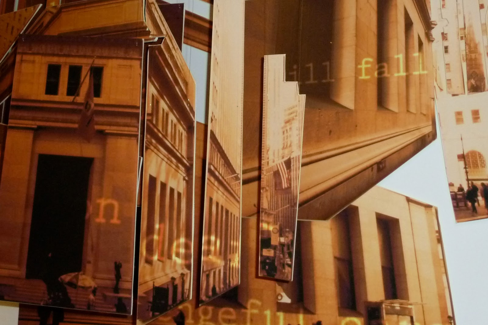
I think the genius of his work comes from the ability to think from a birds-eye view. Literally. Many of his design solutions for architectural space involve a graphic device imposed upon the floorplan of the site, which is then translated to the three-dimensional space.

The translation of this system into the interior space is visually intense and slightly disorienting (I'd have to see it in person to know for sure), but a powerful graphic concept successfully applied to the space. They maintained the curvature of the circles on walls, ceilings and floors, to guide the visitor through the space. No matter how small of the fragment of circle you see, you know where the exit is depending on which direction it's curving.

 |
| Images snagged from L2M3 |

The lightboxes in the lobby give a directional cue for each building area as the letters float in their respective color. The direction that the letters move determines the direction to walk. They infused this boring space with so much imagination and visual interest, I wonder if its made those serious employees have more fun.
I was turned on to the Jacques Greene site by Hoverstat.es today, and found myself relating this experience with the feeling of navigating a transparent modern construction like this one. There are a group of windows at fixed sizes, all playing an individual snippet of the video for this song. But within those windows, there are other windows. So you feel like you're navigating through a fuzzy glass-walled fantasy dream with lots of trees, and a young expressionless girl.
I've never seen a music video broken into individual windows. As I was playing, I was asking myself a whole number of nerdy design questions. How does one window experience differ when it's separated from the rest? Do you need all of them together to understand the full story? You can't close or resize them so there is strictness in the playfulness, and maybe a little too limited because the fun ends there. But I was able to get a full experience of the music without altering the visual experience in any damaging way.
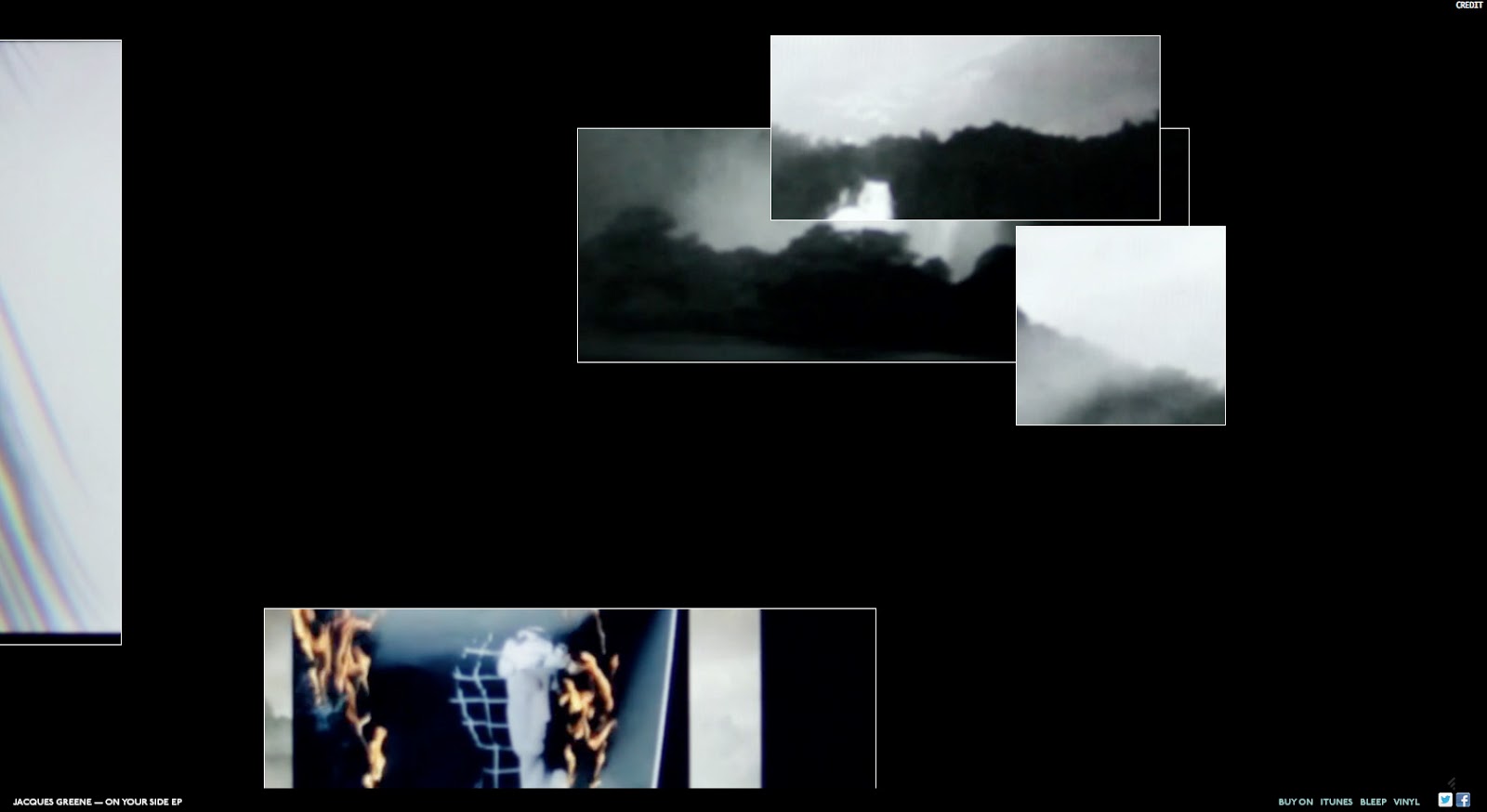
In fact, it was cool to move the windows off screen, stretching the common idea of screen real estate.

This made me think of the A List Apart redesign, launched earlier this year. By using off-canvas real estate to park the blog header and footer, besides frustrating people (including myself), is there a conversation that they are trying to have about the current paradigms of the web? My immediate reaction was that I couldn't scroll up to see more of the logo - the fact that it's cropped activates an existing paradigm that there is more content to see. I thought of Facebook's use of the half profile photo when you first land and you have to scroll up to see the whole thing. But maybe the designers are telling us, PLAY! Don't be so contained within this navigable space. Go out of bounds. It's the adult equivalent of coloring outside the lines with your crayons.
Also, people need to chill. Not everything can be explained. I braved a Matthew Barney presentation at the NYPL a couple weeks ago, and the interviewer seemed scattered and irrelevant at best, offensive at worst. In all honestly, it was just as awkward as one of his films, which was just perfect. I felt like he was trying to get inside Barney's brain.
 |
| Subliming Vessel, Matthew Barney at The Morgan Library and Museum |
After a 25 minute preview of his upcoming film, they began to discuss Barney's current show at the Morgan Library. We saw an image of the drawing above, then viewed a video of the creation of the drawing. The interviewer asked, now what do we know about this drawing now that we've seen the process? He asked Matthew Barney this question! Barney took a beat, and said "the sun in the upper right." And waited for utter confusion to set in. Then he said, "I think it's the most transformative." It was incredible. Not everything needs to be explained, at least in the way people want it to be sometimes.
Barney is inspiring to me because of the way he abstracts concepts from the things that interest him. All of his work is based on the narratives from literature by Norman Mailer and other masculine literary figures and athletes. He has a major focus on the concept of the masculine.
A strong underlying concept provides a bounded space, which allows room for experimentation within, and the work doesn't stray too far outside of those lines.
I was trained by students of Yale modernists, who practiced design by stripping down meaning to its most basic form. I love that process of finding simplicity, but I also love how school taught me to always think of something as something else, everything is contained within its larger category and classified in a way. Like Barthes explains the Japanese theater as the antithesis of theater, as creating distance and of performing the void, where there is a lack of meaning. This is opposite of western theater where it is packed with layers of meaning.
In my work I've found myself more interested in the space between. Nothingness. Emptiness. Spatial relations among architecture for example, are fascinating to me. Windows and the viewpoints they create, portals and perspective in physical space and on the screen. I just finished my freelance work at Code and Theory in preparation for my move to London, and now that I have some free time I'm going to start on a self-initiated project that I think will be a lot of fun. I need a better camera.