Sunday, September 8, 2013
OMG Heyyyyy
So I'm not posting over here anymore. You'll find all of my ramblings and other activities on my new site here: pizzuti.co
Saturday, June 8, 2013
Concept, play, and the space between
I went to see Sascha Lobe speak on Tuesday night at MAD, as part of AIGA design talk extravaganza. He runs L2M3 in Germany. And he's really hot. Once I got over that and started paying attention (lets be honest, I still haven't gotten over it), it reminded me of the work I did with Base Madrid. What a great opportunity that was, and the last time I was able to work on a client project with a strong graphic system.
In web design, each project begins with user experience and develops with a focus on the subtleties of interactions rather than making a bold, design-first, graphic system, especially if it would get in the way of proper navigation of the site. I must admit, I was envious of Lobe's work. It's aggressive, and risk-taking. I would like to take these graphic design lessons with me into the web world where I'm currently working. One of the questions after his presentation was, how do you get this work approved? He said he's been asked that many times but that he hasn't run into much resistance. Hm. When there is a strong reason for the design, he explained, then it is hard to argue against it.
I think the genius of his work comes from the ability to think from a birds-eye view. Literally. Many of his design solutions for architectural space involve a graphic device imposed upon the floorplan of the site, which is then translated to the three-dimensional space.
 In response to the odd fact that the building entrance is section E and they weren't able to change the coding, L2M3 created a graphic device of concentric rings to guide the application of the wayfinding system. It's as if a pebble were being dropped down at E and rippling out to other parts. The occupant is mtz Münchner Technologie Zentrum, and that is the extent of my knowledge about this company. Their website is really boring. And in German.
The translation of this system into the interior space is visually intense and slightly disorienting (I'd have to see it in person to know for sure), but a powerful graphic concept successfully applied to the space. They maintained the curvature of the circles on walls, ceilings and floors, to guide the visitor through the space. No matter how small of the fragment of circle you see, you know where the exit is depending on which direction it's curving.


The lightboxes in the lobby give a directional cue for each building area as the letters float in their respective color. The direction that the letters move determines the direction to walk. They infused this boring space with so much imagination and visual interest, I wonder if its made those serious employees have more fun.
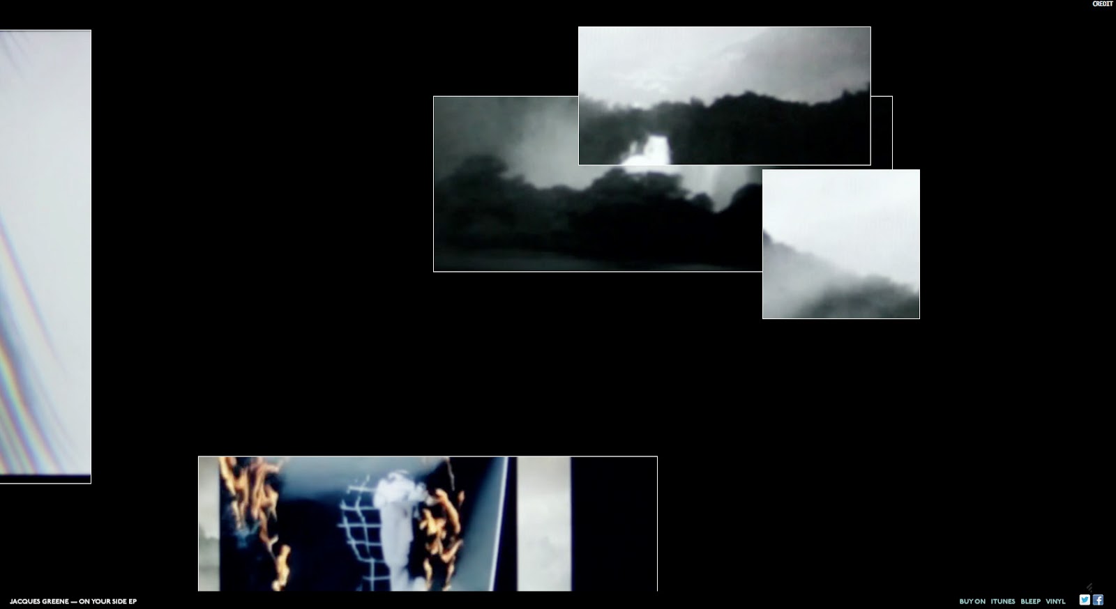
I was turned on to the Jacques Greene site by Hoverstat.es today, and found myself relating this experience with the feeling of navigating a transparent modern construction like this one. There are a group of windows at fixed sizes, all playing an individual snippet of the video for this song. But within those windows, there are other windows. So you feel like you're navigating through a fuzzy glass-walled fantasy dream with lots of trees, and a young expressionless girl.
I've never seen a music video broken into individual windows. As I was playing, I was asking myself a whole number of nerdy design questions. How does one window experience differ when it's separated from the rest? Do you need all of them together to understand the full story? You can't close or resize them so there is strictness in the playfulness, and maybe a little too limited because the fun ends there. But I was able to get a full experience of the music without altering the visual experience in any damaging way.

In fact, it was cool to move the windows off screen, stretching the common idea of screen real estate.

This made me think of the A List Apart redesign, launched earlier this year. By using off-canvas real estate to park the blog header and footer, besides frustrating people (including myself), is there a conversation that they are trying to have about the current paradigms of the web? My immediate reaction was that I couldn't scroll up to see more of the logo - the fact that it's cropped activates an existing paradigm that there is more content to see. I thought of Facebook's use of the half profile photo when you first land and you have to scroll up to see the whole thing. But maybe the designers are telling us, PLAY! Don't be so contained within this navigable space. Go out of bounds. It's the adult equivalent of coloring outside the lines with your crayons.
In web design, each project begins with user experience and develops with a focus on the subtleties of interactions rather than making a bold, design-first, graphic system, especially if it would get in the way of proper navigation of the site. I must admit, I was envious of Lobe's work. It's aggressive, and risk-taking. I would like to take these graphic design lessons with me into the web world where I'm currently working. One of the questions after his presentation was, how do you get this work approved? He said he's been asked that many times but that he hasn't run into much resistance. Hm. When there is a strong reason for the design, he explained, then it is hard to argue against it.
I think the genius of his work comes from the ability to think from a birds-eye view. Literally. Many of his design solutions for architectural space involve a graphic device imposed upon the floorplan of the site, which is then translated to the three-dimensional space.

The translation of this system into the interior space is visually intense and slightly disorienting (I'd have to see it in person to know for sure), but a powerful graphic concept successfully applied to the space. They maintained the curvature of the circles on walls, ceilings and floors, to guide the visitor through the space. No matter how small of the fragment of circle you see, you know where the exit is depending on which direction it's curving.

 |
| Images snagged from L2M3 |

The lightboxes in the lobby give a directional cue for each building area as the letters float in their respective color. The direction that the letters move determines the direction to walk. They infused this boring space with so much imagination and visual interest, I wonder if its made those serious employees have more fun.
I was turned on to the Jacques Greene site by Hoverstat.es today, and found myself relating this experience with the feeling of navigating a transparent modern construction like this one. There are a group of windows at fixed sizes, all playing an individual snippet of the video for this song. But within those windows, there are other windows. So you feel like you're navigating through a fuzzy glass-walled fantasy dream with lots of trees, and a young expressionless girl.
I've never seen a music video broken into individual windows. As I was playing, I was asking myself a whole number of nerdy design questions. How does one window experience differ when it's separated from the rest? Do you need all of them together to understand the full story? You can't close or resize them so there is strictness in the playfulness, and maybe a little too limited because the fun ends there. But I was able to get a full experience of the music without altering the visual experience in any damaging way.
In fact, it was cool to move the windows off screen, stretching the common idea of screen real estate.

This made me think of the A List Apart redesign, launched earlier this year. By using off-canvas real estate to park the blog header and footer, besides frustrating people (including myself), is there a conversation that they are trying to have about the current paradigms of the web? My immediate reaction was that I couldn't scroll up to see more of the logo - the fact that it's cropped activates an existing paradigm that there is more content to see. I thought of Facebook's use of the half profile photo when you first land and you have to scroll up to see the whole thing. But maybe the designers are telling us, PLAY! Don't be so contained within this navigable space. Go out of bounds. It's the adult equivalent of coloring outside the lines with your crayons.
Also, people need to chill. Not everything can be explained. I braved a Matthew Barney presentation at the NYPL a couple weeks ago, and the interviewer seemed scattered and irrelevant at best, offensive at worst. In all honestly, it was just as awkward as one of his films, which was just perfect. I felt like he was trying to get inside Barney's brain.
 |
| Subliming Vessel, Matthew Barney at The Morgan Library and Museum |
After a 25 minute preview of his upcoming film, they began to discuss Barney's current show at the Morgan Library. We saw an image of the drawing above, then viewed a video of the creation of the drawing. The interviewer asked, now what do we know about this drawing now that we've seen the process? He asked Matthew Barney this question! Barney took a beat, and said "the sun in the upper right." And waited for utter confusion to set in. Then he said, "I think it's the most transformative." It was incredible. Not everything needs to be explained, at least in the way people want it to be sometimes.
Barney is inspiring to me because of the way he abstracts concepts from the things that interest him. All of his work is based on the narratives from literature by Norman Mailer and other masculine literary figures and athletes. He has a major focus on the concept of the masculine.
A strong underlying concept provides a bounded space, which allows room for experimentation within, and the work doesn't stray too far outside of those lines.
I was trained by students of Yale modernists, who practiced design by stripping down meaning to its most basic form. I love that process of finding simplicity, but I also love how school taught me to always think of something as something else, everything is contained within its larger category and classified in a way. Like Barthes explains the Japanese theater as the antithesis of theater, as creating distance and of performing the void, where there is a lack of meaning. This is opposite of western theater where it is packed with layers of meaning.
In my work I've found myself more interested in the space between. Nothingness. Emptiness. Spatial relations among architecture for example, are fascinating to me. Windows and the viewpoints they create, portals and perspective in physical space and on the screen. I just finished my freelance work at Code and Theory in preparation for my move to London, and now that I have some free time I'm going to start on a self-initiated project that I think will be a lot of fun. I need a better camera.
Monday, June 3, 2013
The freelance life/ Moving on
Over the past few years, I've learned a lot about working as a designer. I have a lot of passion for what I do, and doing good work is very important to me.
As a freelancer, I've felt a bit like a nomad. I've worked on great projects for large and small clients, and appreciate the experience of working at agencies of varying size, in-house, etc. While the freelance life has given me flexibility and wisdom about many different environments, there have been situations where I haven't been able to make the level of contribution that I would like to.
There was one time in particular when I was working on a very large team and I felt that it would be impossible to actually do good work (which is unfortunate by itself), but what was really disappointing to me is that I felt that regardless of how hard I fought for it, I wouldn't be able to make much difference. I realize now that no one is going to give you that entitlement, regardless of your employment status as freelance or full-time. Since then I've decided that I will always take a strong stance and do my best to prevent a situation that could compromise the quality of my work, even if it causes me discomfort.
I am truly ready to land somewhere full-time, making the highest level of contribution possible. I honestly can't wait.
Sunday, March 31, 2013
Making connections
In the past few years since I started this blog, it's biggest purpose has been to make connections between the thoughts in my head and the work I'm doing. I have a major connection to make, that gets to the heart of why I do what I do.
For the past four months I've been working at digital advertising agency LBi (now MRY). It's a hidden behemoth of a space behind Flatiron's grey walls. You could literally work there for four years and not meet everyone, but I'm working in the creative department among a bustling extravaganza of interesting folks.
LBi calls themselves a marketing agency for the digital world, so my job is to design beautiful online advertisements in the form of websites. I suppose it could be argued that every website is that, however the websites I'm designing are promoting consumer products like this one for Neutrogena.

This is a new one for me but it's reminded me a lot of what both of my parents devoted their lives to - marketing consumer products. My mom started her own direct marketing business in the 80's and People's Bank and Harrah's were among her clients. My dad worked at General Foods for a thousand years and was VP of Sales and Marketing.
Every trip to the supermarket was analyzed for product placement, and every commercial on TV was picked apart. He spent so much time managing the Maxwell House brand I remember I had a mixtape with all of the different options for "jingles"...
I feel more of a connection to them with this work because the feedback we get from the client might be feedback that they would have given to a creative team. It doesn't make it any better (ha!) but at least I understand the client perspective. As a designer I have this practical side that was probably instilled by my corporate parents. Design is a perfect balance for me (even though I will always secretly wish I was a conceptual artist). I love helping people to develop their brand, and providing the valuable service of design, and working within the energy of a creative team.
For the past four months I've been working at digital advertising agency LBi (now MRY). It's a hidden behemoth of a space behind Flatiron's grey walls. You could literally work there for four years and not meet everyone, but I'm working in the creative department among a bustling extravaganza of interesting folks.
LBi calls themselves a marketing agency for the digital world, so my job is to design beautiful online advertisements in the form of websites. I suppose it could be argued that every website is that, however the websites I'm designing are promoting consumer products like this one for Neutrogena.
This is a new one for me but it's reminded me a lot of what both of my parents devoted their lives to - marketing consumer products. My mom started her own direct marketing business in the 80's and People's Bank and Harrah's were among her clients. My dad worked at General Foods for a thousand years and was VP of Sales and Marketing.
Every trip to the supermarket was analyzed for product placement, and every commercial on TV was picked apart. He spent so much time managing the Maxwell House brand I remember I had a mixtape with all of the different options for "jingles"...
I feel more of a connection to them with this work because the feedback we get from the client might be feedback that they would have given to a creative team. It doesn't make it any better (ha!) but at least I understand the client perspective. As a designer I have this practical side that was probably instilled by my corporate parents. Design is a perfect balance for me (even though I will always secretly wish I was a conceptual artist). I love helping people to develop their brand, and providing the valuable service of design, and working within the energy of a creative team.
Thursday, December 13, 2012
Endings, and new beginnings
New and improved! Identity for The Writers Room:

Sometimes I work at their space on Astor and Broadway and I'm secretly hoping that I learn how to be a writer by osmosis. Side note about the logo: the tagline is just a friend to the logo, they're not married. The logo can easily survive on its own :)
In other news, The New School site just launched. newschool.edu
I am really happy with how it turned out. I worked on the home page, academics page, and other top level pages. It was my first big client foray into responsive design, and I'm still collecting my thoughts on the topic. I really enjoyed Rob Giampietro's presentation at this year's Build conference, entitled, "Unbuilding".
In the presentation he uses the metaphor of UN-building, of removal, or reversal, to describe the current era of web design. The truth is, we have not had the opportunity to see this era very objectively yet. It is so new. But he makes a great point, that there is no web design canon. What museum do you know that has websites in their collections? Museums, do you hear me?? I dare you to start! Here is one suggestion: http://www.grafill.no/
The thing that attracts me to web design is the same thing that probably keeps museums away. There are too many competing factors that go into the design, and it's quite a commercial process in most cases. I have an app called The Silent History, which I highly recommend to anyone interested in stunning visual design combined with storytelling. It's quite disorienting at first, then you become captivated by the novel itself and fall in love with the sexy interface. It's inspiring for my personal project because the freedom to create without restriction is palpable.
I went to the AIGA "Future of Design" talk last night, and one of the points that I took from it was to constantly be developing self-initiated projects. If you are interested in ground-breaking, in innovation, you need to look past the needs of today.
My two freelance projects are almost wrapped so perfect timing to make a fresh start for the new year! Here we go!!!!!
Saturday, November 17, 2012
We're not in Madrid anymore, Toto
SO much has happened, y'all.
Ok so yeah, I'm not living in Spain anymore. What an incredible experience to have lived in Madrid for nine months, working with the good people at Base.
 Whilst in Madrid, I created a signage system for this building. A recently renovated building in historical bustling downtown Madrid. We got as far as laying out the production specs until the project fell victim to the Spanish economy and I had to return home...
During this same time I started work on a couple web projects and thinking a lot about designing for digital space. I've been fascinated by interactive design for years but recently I've turned full-throttle to interactive design and can be overheard calling myself a "web designer". My opinion, however, is that design is design. If you have a strong process and can design something beautiful for a billboard or giant glass building, you can design for various screen sizes.
My fascination with designing for the web centers around my tendency to think in systems. I NEED to think in systems in fact, it's the only way I can think. Therefore the logical start to any of my projects is to think deeply about the user experience, flow of the site, and build out the information architecture before any visual design decisions are made. The transition from designing for physical architecture to digital has been very natural and intuitive for me.
So WTF have I been doing since I got back to New York City? The New School brought me on board as a freelancer to redesign their website. I designed a new responsive home page and top level pages, plus lent a hand with a division website. Hoping that will launch smoothly in the next few weeks, it's in user testing now.
I designed and coded this site: gaystraightlove.com (with the help of Miranda Li, PHP goddess).
Now I'm working on a website for The Writers Room, which I'm happy to say will be built on the same responsive Wordpress framework. I love using themes that just get out of the way. The simpler the better because then the typography and other elements of the site are what's communicating.

Here is the identity system that I created for the organization, a community working space for writers in New York City that's been around since the 70's. The graphic device alluding to the overhead view of the room would change in orientation based on the usage. The website redesign is in progress.
Also, I was in San Francisco earlier this week for An Event Apart, an awesome web conference helmed by Jeffrey Zeldman and Eric Meyer. The conference seriously dropped some knowledge on us all, and I met some really great people working in every facet of the digital world that you could imagine. I didn't even know that some of these jobs existed, like designing the software for the card that you install to optimize your computer for gaming. Ok.
My biggest takeaway from the conference was probably its biggest theme:
The device doesn't matter.
There are so many people much smarter than me talking about these things, but I'm just going to say that there is a revolution in the air, and I'm excited to be catching the wave of innovation at this early stage. Luke Wroblewski talked about the sizes and resolutions of all the devices that were introduced to the market in the last 8 weeks - it was a mindblowing array that covered the entire range of small to large. Mobile can no longer be defined because it's edging into tablet sizes, and touch needs to be considered on all devices including the largest desktops. So what's the bottom line here? The device does not matter! Content and design need to start at the simplest level and that makes me, a reluctant to be labeled minimalist, very happy. I hate superfluity (I don't even think that's a word).
Anyways, here are some links to articles that these really smart people have written on the subject of designing for mobile/content first. Highly recommended reading for anyone interested in the subject.
Brian and Stephanie Reiger:
http://yiibu.com/articles/rethinking-the-mobile-web/page-3.html
http://www.uxbooth.com/articles/its-about-people-not-devices/
Luke Wroblewski:
http://www.alistapart.com/articles/organizing-mobile/
Jeremy Keith:
http://adactio.com/journal/4443/
Cameron Koczon:
http://www.alistapart.com/articles/orbital-content/
Karen McGrane:
http://www.alistapart.com/articles/your-content-now-mobile/
Brad Frost:
http://www.alistapart.com/articles/for-a-future-friendly-web/
I have lots more to say about the design implications of this process, but that's for another day. cheers to a better web for us all.
Ok so yeah, I'm not living in Spain anymore. What an incredible experience to have lived in Madrid for nine months, working with the good people at Base.
During this same time I started work on a couple web projects and thinking a lot about designing for digital space. I've been fascinated by interactive design for years but recently I've turned full-throttle to interactive design and can be overheard calling myself a "web designer". My opinion, however, is that design is design. If you have a strong process and can design something beautiful for a billboard or giant glass building, you can design for various screen sizes.
My fascination with designing for the web centers around my tendency to think in systems. I NEED to think in systems in fact, it's the only way I can think. Therefore the logical start to any of my projects is to think deeply about the user experience, flow of the site, and build out the information architecture before any visual design decisions are made. The transition from designing for physical architecture to digital has been very natural and intuitive for me.
So WTF have I been doing since I got back to New York City? The New School brought me on board as a freelancer to redesign their website. I designed a new responsive home page and top level pages, plus lent a hand with a division website. Hoping that will launch smoothly in the next few weeks, it's in user testing now.
I designed and coded this site: gaystraightlove.com (with the help of Miranda Li, PHP goddess).
Now I'm working on a website for The Writers Room, which I'm happy to say will be built on the same responsive Wordpress framework. I love using themes that just get out of the way. The simpler the better because then the typography and other elements of the site are what's communicating.

Here is the identity system that I created for the organization, a community working space for writers in New York City that's been around since the 70's. The graphic device alluding to the overhead view of the room would change in orientation based on the usage. The website redesign is in progress.
Also, I was in San Francisco earlier this week for An Event Apart, an awesome web conference helmed by Jeffrey Zeldman and Eric Meyer. The conference seriously dropped some knowledge on us all, and I met some really great people working in every facet of the digital world that you could imagine. I didn't even know that some of these jobs existed, like designing the software for the card that you install to optimize your computer for gaming. Ok.
My biggest takeaway from the conference was probably its biggest theme:
The device doesn't matter.
There are so many people much smarter than me talking about these things, but I'm just going to say that there is a revolution in the air, and I'm excited to be catching the wave of innovation at this early stage. Luke Wroblewski talked about the sizes and resolutions of all the devices that were introduced to the market in the last 8 weeks - it was a mindblowing array that covered the entire range of small to large. Mobile can no longer be defined because it's edging into tablet sizes, and touch needs to be considered on all devices including the largest desktops. So what's the bottom line here? The device does not matter! Content and design need to start at the simplest level and that makes me, a reluctant to be labeled minimalist, very happy. I hate superfluity (I don't even think that's a word).
Anyways, here are some links to articles that these really smart people have written on the subject of designing for mobile/content first. Highly recommended reading for anyone interested in the subject.
Brian and Stephanie Reiger:
http://yiibu.com/articles/rethinking-the-mobile-web/page-3.html
http://www.uxbooth.com/articles/its-about-people-not-devices/
Luke Wroblewski:
http://www.alistapart.com/articles/organizing-mobile/
Jeremy Keith:
http://adactio.com/journal/4443/
Cameron Koczon:
http://www.alistapart.com/articles/orbital-content/
Karen McGrane:
http://www.alistapart.com/articles/your-content-now-mobile/
Brad Frost:
http://www.alistapart.com/articles/for-a-future-friendly-web/
I have lots more to say about the design implications of this process, but that's for another day. cheers to a better web for us all.
Tuesday, June 5, 2012
Almost my mom's birthday
Since it's almost my mom's birthday, I'm posting this picture from the streets of Lisboa that I know she would have loved. She would be 65 this year on June 8th.


Wednesday, May 23, 2012
A sense of place and frameworks for the web
Previously, I've written about the differences between looking at digital vs architectural space, but I'm also interested in the similarities. There are two concepts in web design/user experience that come from the physical world. Number one, a sense of place. Two, frameworks.
How do you create a sense of place when designing for the web? It could be as simple as having some repetitive elements that create an element of familiarity. I think Steve Krug can help us with this answer. I'm almost finished reading his web usability bible, "Don't Make me Think", and there are many gems worth remembering.
In the web space, there are some idiosyncrasies that you will not find in the physical world. He describes the experience as being dropped from the sky into the middle of a maze, or being lost in space. There is no sense of scale, no sense of direction and no sense of location. Probably why the back button accounts for 30-40 percent of all web clicks. Tools like clearly visited links, breadcrumbs, persistent navigation and site identification (as home button) make the experience much more enjoyable and less confusing for the user.
Another metaphor with the physical world: web navigation as streetsigns. Navigation is so much more than just a feature of the website - it IS the website. It shows you the content, where to begin, and it gives a sense of place, of feeling grounded. If a site is done well, it will clearly tell you where you've been, where you are in this moment, and where you need to go.

Liz Danzico writes about frameworks on 52 weeks of UX, and she relates designing them to creating opportunities, possibilities for action for the user. Just as in architectural space, if the frameworks are too strict it limits the possibilities for movement - there is less freedom. However, if there is no structure or organization, then it leaves open the possibility for chaos. Designers have the responsibility to create a balance between these two extremes.
Erving Goffman, whom Danzico dubs the father of framework analysis, describes the delicate balance: "Frameworks allow people to locate, identify, and label an infinite number of concrete occurrences. People can move through the complex framework of a city or a website, but they’re unlikely to be aware of it or even be able to describe it if asked. People fit their actions into the ongoing world that support a set of activities—the “anchoring of activities.” It gives them context and interpretation from their point of view. Be clear, but leave room for stories to be told and to flourish."
Storytelling as a metaphor for web interaction - the more engaging the site, the more people will be attracted and encouraged to be themselves, be social, and tell their unique story.
Tuesday, May 1, 2012
Truth, transparency and the web
My current preoccupation is with visual characteristics of websites I've encountered lately. I'm working on two web projects - one for a client and one for my own idea - and in my research I've been observing some interesting trends in digital space.
When creating an identity for a new business, one of the most important components is the web experience. Like a building facade, it has to communicate the brand, but a website also has to attract and interact with the user.
The most successful web designers have a style that is clean, luxurious and polished - Happy Cog for example, helmed by Jeffrey Zeldman (who I randomly just found out that I'm related to in an extended family kind of way).
However, I'm fascinated by the sites that seem raw and unfinished, that evoke an earlier era of web design. It was ugly back then, with layouts dominated by tables, low resolutions and bright flashing pixelly icons. Remember the kitschy counters? The ones at the bottom of web pages that tracked visits?
Ah, the days before Google analytics seem so barbarian now, but I love it and here's why. People are attracted to truth and to transparency. Early web design had a distinct way of exposing all the seams and being so innocent, true to its medium, quirks and all.
And here's why I have massive respect for web developers now. There are so many layers involved with website development - HTML/ CSS/ javascript/ Content management/ etc. That something so flat and linear as code can create beautiful dimensional designs seems farfetched, but design on the web can be clean, beautiful, minimal, textured, delicious. That developers can disguise the limitations of digital space is a massive feat.
I appreciate the juicy navigation, illustrations, and that letterpress look that web designers use to make the web more beautiful, but is web design about disguising the limitations of digital space? Or can we play with the limitations and expose the seams?

A website for the wine label Casa Mariol by Barcelona designers Bendita Gloria exposes the quirky characteristics of web design by using antiquated clip art and tables, which no self-respecting web designer would dream of implementing... until now. How unconventional and beautiful is this brand? This style reminds me of the Metahaven.com sites (at this moment it's gyrus.net, selling domain names), which offers every product and service imaginable and do everything but refer to the design studio. The real Metahaven site still doesn't show images of past work, only a list of clients and current projects.
These are clever plays on the quirkiness of the web. Also, I am really interested in sites that expose the architecture underneath... in a more organized Swiss modern kind of way. For example, I love this site, the grid system that shows the grid underlying the content of the page. And on this theme, this site is nicely done, revealing the grid that the page is organized with and using it as a bold navigation element. Another example of being really straightforward with no bells and whistles, Google (everything) is an example of functional utilitarian web design. The user interface on those sites makes me comfortable because I know it just is what it is, and it's not trying to be something it's not (print).
This portfolio site from Rebecca Stephany (is there a distinct style from Gerrit Reitveld?) has a carefree, intentionally haphazard collection of work and conveys a distinct personality. And Stephany's artist statement is translated by the Dada poetry generator, which I think is a perfect complement to her work. This site, Forms of Inquiry, isn't much to look with the bold, blue headlines and no styling whatsoever. But now I'm getting the feeling that:
unfinished/"undesigned"/whatever you want to call it
= transparency
= truth.
And that will always be what I'm after.
Maybe ugly is the new beautiful.
I'll leave you with a way to visualize the changes happening in web space. Here are two sets of icons, pixel-based vs letterpress.


Friday, April 27, 2012
Architecture that tells a story
Madrid definitely has an eclectic mix of architecture, as I've already posted a few examples of (lizard and wedding cake buildings, most ostentatious belle epoque, and Herzog and de Meuron's masterpiece). You can really get a feel for the history of Spain, just by walking around and observing different architectural influences over the centuries. Unfortunately, few examples remain of the rich mudéjar style developed by the Moors that I lavished in on my trip to Andalucía. Some of the only reminders of the Muslim origins of Madrid are the remaining pieces of the Muralla Árabe (Arab Wall).
There are some fascinating and seemingly forgotten old buildings if you can find them, tucked away next to sober dictatorship-era construction. One of the sites that caught my imagination was this ancient construction, which has been converted into the Biblioteca Escuelas Pías (Pious school library). It's located in Lavapiés, the old Jewish barrio, where there are some sites related to Inquisition history that I will post about next.


 And characteristic of Madrid, it's juxtaposed next to this odd urban plaza straight out of a post-Modern dream. By the way, this is not a great neighborhood and I wouldn't recommend walking around here at night, but this is a fascinating area with so much history and worthy of a daytime exploration.
 Plaza de la Villa
The intimate Plaza de la Villa on Calle Mayor is one of Madrid's more notable example's of Madrid-style baroque architecture (barroco madrileño), with wonderfully preserved buildings on all three sides. This square was the permanent seat of the Madrid city government from the Middle Ages, until they relocated to the Palacio de Comunicaciones in recent years.
On the eastern side of the square is the 15th century Casa de los Lujanes, a Gothic construction with clear mudéjar influence. The brickwork tower is said to have housed the imprisoned French monarch Francois I and his sons after the Battle of Pavia in 1525. As the prisoner was paraded down Calle Mayor, it was said that locals were more impressed with the lavishly attired Frenchman than his captor the Spanish Habsburg emperor Carlos I.

This is the really cool and creepy door to the tower - it's on the northern side of the building as you curve around a tiny street that feeds into the plaza.


 Is anyone as obsessed as I am with the Google street maps photos option? It lets you see different viewpoints, times, and seasons simultaneously in one place, and it even tries to match the perspective of the photo, creating a new three-dimensional plane for the various contributions. How cool.
There are some fascinating and seemingly forgotten old buildings if you can find them, tucked away next to sober dictatorship-era construction. One of the sites that caught my imagination was this ancient construction, which has been converted into the Biblioteca Escuelas Pías (Pious school library). It's located in Lavapiés, the old Jewish barrio, where there are some sites related to Inquisition history that I will post about next.


The intimate Plaza de la Villa on Calle Mayor is one of Madrid's more notable example's of Madrid-style baroque architecture (barroco madrileño), with wonderfully preserved buildings on all three sides. This square was the permanent seat of the Madrid city government from the Middle Ages, until they relocated to the Palacio de Comunicaciones in recent years.
On the eastern side of the square is the 15th century Casa de los Lujanes, a Gothic construction with clear mudéjar influence. The brickwork tower is said to have housed the imprisoned French monarch Francois I and his sons after the Battle of Pavia in 1525. As the prisoner was paraded down Calle Mayor, it was said that locals were more impressed with the lavishly attired Frenchman than his captor the Spanish Habsburg emperor Carlos I.

This is the really cool and creepy door to the tower - it's on the northern side of the building as you curve around a tiny street that feeds into the plaza.


Monday, April 23, 2012
Giant pink sheep in the Puerta de Alcalá

I think the only thing the Puerta de Alcalá is missing is a giant pink sheep. Here's why.
Around November 20th every year, shepherds bring their flocks of sheep directly through the center of Madrid, in between these two stone markers (mojones) on the eastern side of Plaza Alcalá. This is supposed to be quite a scene, and it's a tradition that dates back to 1273 during the time of King Alfonso X. Livestock owners founded an organization that was empowered with keeping open livestock paths throughout the country, enabling the sheep to move between the northern and southern provinces and avoid the cold weather.
The pathway marked at Puerta de Alcalá is one of the last of nine remaining in Spain. If you go to look for the mojones, they are really easy to miss. One is to the left of the entrance to Retiro Park, and the other is on the northeast corner of the Plaza de la Independencia.


All of the livestock paths were of varying width, but the widest at 75.23 meters are knows as cañadas reales (royal livestock passageways). The width between the two markers is ceremoniously measured by the shepherds each time they bring their flock into the city, reasserting their rights and confirming the path established 800 years ago.
So back to my giant pink sheep idea. We all need something that disconnects us from our everyday lives sometimes, and encourages us to see our surroundings in a new way. Madrid, as viewed through the arches of the puerta de Alcalá, soaring up the Gran Via, has an entirely different cadence with a giant pink sheep in the foreground. It allows city dwellers to break from reality and enter a bright, colorful fantasy city.
The installation creates its own narrative while at the same time uncovering an existing, forgotten one. Like the artworks I've posted on this blog, this intervention uses an existing viewpoint, and offers a way to experience the landscape with a point of comparison. The visual comparison is any aspect of the form: color, material, shape, angle, scale, etc. The possible material I could use reminds me of my beloved Breyer horses that I used to play with incessantly as a kid - impossibly smooth plastic.
The giant pink sheep would coincide with the actual running of the sheep in November and there would be at least one where the flock enters Madrid (above), and possibly others at different points along the trail.
Wednesday, April 18, 2012
Ornate street signs that I have to finally post about
I've been secretly wanting to post about the street signs in Madrid ever since I moved here. Each street in Madrid has a sign intricately painted on nine white tiles that commemorates its history, and some of the illustrations have dark stories to tell.

This one tells the story of a miracle, and you can read it here on my Cowbird page, or just keep reading.

This means "fist in the face street", and it's not because of a street fight long ago. Puñonrostro is actually someone's last name.

Sword Street, because there was a fencing school on this street and the owner always left a sword hanging in front of his house to advertise.

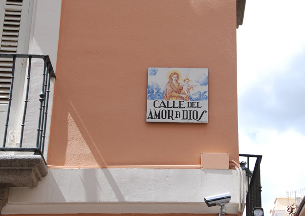
 And lastly, our street! Calle del Amor de Dios. Looks like we've got double protection - from the gods and the surveillance cameras.

This one tells the story of a miracle, and you can read it here on my Cowbird page, or just keep reading.
Legend has it that a wealthy
priest once lived on this street, whose possessions were coveted by his
Portuguese servant. One night the servant killed the priest, cut off his
head, and ran off to Lisbon with all of the gold and valuables in the
house.
When the priest's body was discovered it
became the talk of Madrid, but since the servant had escaped, after
some time the crime was mostly forgotten.
Some years later however, the servant
returned to Madrid, now dressed in the guise of a prosperous gentleman.
He was walking through the Rastro one morning (the city's largest market
and slaughterhouse), not far from where the crime had been committed,
and decided to buy a calf's head for his dinner (a common dish in
Spanish villages at this time). After buying the calf's head, he placed
it under his cape and began to walk home.
A nearby watchman noticed blood dripping
from under the servant's cape, and stopped him to demand to know what
it was. "It is the calf's head I just bought at the market", he told
him. But the watchman was still suspicious and he asked to see it.
When the servant opened his cape, to
both of their astonishment and horror, it was the head of the priest
that he had murdered. The watchman immediately arrested him and brought
him to jail. In the trial that followed, the former servant was found
guilty and sentenced to be hanged in Plaza Mayor.
Once the execution had been carried out, the priest's head turned back into that of a calf.

This means "fist in the face street", and it's not because of a street fight long ago. Puñonrostro is actually someone's last name.

Sword Street, because there was a fencing school on this street and the owner always left a sword hanging in front of his house to advertise.

 |
| Calle de Jesus |
 |
| I love this one. |
 |
| This is the only pictogram street sign I've found so far! |
Ella: Geting closer
I just rediscovered this video that I created with Imovie last fall. I was taking various videos in my explorations around my new city of Madrid. I called it Ella after the fictional character in many of my creations, who may imbue many of my own characteristics.
Saturday, March 31, 2012
Thoughts on the Palacio de Cristal and the translation of architectural space to digital
Some background for this post: I started thinking about and writing about space for an academic paper submission. This is a culmination of a few months of thoughts and notes scattered through various notebooks, word docs and scraps of paper. I found it really interesting that everything I've been thinking about over this length of time is related and builds upon itself.
We enter digital space through windows - the frames of our monitors, browsers and webpages. In the digital cocoon, we do feel safe to explore.
Google Earth has made it possible to traverse the entire world with one swipe. We can reach through space, soar over architecture and place ourselves in the middle of the streetscape with a 360 degree viewpoint, almost like real life. The recently launched Google Art Project is a site that allows the user to explore museums room by room, and enjoy the collection in high resolution on the computer screen. The website displays the photo of the artwork with a handy sidebar containing its significance and location on the museum floorplan.
For the past five months I've lived in Madrid, and
only recently did I discover the Palacio Cristal, a site for temporary
exhibitions of the Museo Reina Sofia, during a run through the Retiro Park. At
the time I didn't have a chance to go inside, so once I got home I looked up
the collection on Google Art Project, but the sensorial magic of viewing the
artwork in context of the museum space was lost.
As much as these digital capabilities are beneficial
to those who cannot travel, the experience of architectural space combined with
artwork in-person is full nourishment for the senses. The experience from the
computer screen is no more or less valuable than being in-person, but it is a
re-appropriation of space and therefore an entirely different sentient experience.
Few spaces have impacted me in the same way as the
Palacio Cristal. In front of the building there is a small man-made lake, then
the gaze rises up stairs immersed directly in the water all the way to the
entrance with its combination of cast-iron and massive panes of glass yearning
for the sky. It was the view of the entrance that first enchanted me, from my
safe place leaning against the railing next to the pond. I looked up to enjoy
layer upon layer of panes of glass broken up and organized with much heavier,
structural, tactile materials. The effect of heavy and light, dark and
brilliant, opaque and transparent - the multiple dualities have a powerful
effect on the senses.
Notably, the relationship between the glass windows
and water is amplified by the intimacy of the space. Although it is located on
a large hilltop in the Retiro, as you walk up the hill there is a profound
feeling of comfort, intimacy, peace and solitude even among the throngs of
visitors. It is on the petite, antique scale like so many other places in
Madrid, which is what makes the striking architecture even more profound.
The Palacio Cristal was built in 1887 by architect
Ricardo Velázquez Bosco, intended to display the flora and fauna of the
Phillipines for an upcoming exhibition in Madrid. An important aspect of this
enchanted space is that on the other side of the building from the lake, there
is a loyal circle of chestnut trees - mirroring the vertical gesture of the
structure's columns and nature's counterpart to the massive weight of the
cast-iron.
The space is ethereal and alluring - it absorbs the
beauty that surrounds it and reflects back an image amplified. The impact of
the space comes from the concatenation of all the different elements and our
immersion in the space that is created between them.
If sensory immersion brings full understanding,
should our intention be to replicate this experience in digital space with
platforms such as Google Earth and Google Art Project, or are there other ways
to exploit the characteristics of the web to provide a layered and unique
journey? To use an historical example, Paul Klee's Rotating House (1921) is a two-dimensional painting
created with oil and pencil on a muslin cloth, but miraculously takes us on an
adventure of space, perception and perspective. Klee captures the feeling of
the intimacy of space while also referencing all of the various perspectives
and viewpoints offered to us by looking outside from our home using the
abstract form of windows. He took advantage of primitive tools and manipulated
them to a level of dynamic three-dimensionality without resorting to the
replication of three-dimensional space. He simply wanted to explain the way
space works.
Having lived in New York City for nine years prior to
my move to Madrid, I relate to this need to define my surroundings from a
protected space that I can peer through. In cities, windows comprise a large
portion of our surroundings, and provide a viewpoint into the soul of the city
- human and architectural. They can tell their own story, or inspire a city's
mythology. The mythology can be completely in our imagination or very real and
overwhelming. We are immersed in the city, and sometimes lost. As if we are
surrounded by the tallest trees in a forest of thick evergreens, and we don't
know the way out.
The Palacio Cristal offers the opposite effect of
being immersed in the middle of the city with windows staring down at you. The
feeling of being looked at is reversed and now you are the one looking in, now
you have the power, not a singular pedestrian oppressed by the blank stare of
hundreds of windows. Now, the building gererously opens itself to you with a
valiant effort of transparency and openness. Somehow, we feel protected here,
and we know it's ok to look.
How can a designer of digital spaces represent the
feeling of the layers of place in a digital context? There are profound
differences between physical and digital space. The digital experience
disconnects us from our senses but adds the inherent safety and control of an
experience entirely on our computer screen. Given the opportunity of our
current technologies, how can the interactivity of traveling through a digital
place be established?
One solution may lie in the exhausted but extremely
valuable concept of community. In multiple locations around the United States
and abroad, BOOM, a hip new retirement development is being planned for the
aging LGTB community. The architects commissioned Bruce Mau Design to develop
the website, identity and social media, years before the physical site will
even be open to residents. This is an innovative way to begin the conversation
and encourage interest and exploration of the development at a very early
stage. And certainly one way to allow users to reach into the space to pull out
information that they need, or discover things they didn't even know they
needed.
The digital space can provide a platform with the
opportunities both to express and to learn. It can offer a duality of giving
and taking, sometimes by the same people and sometimes different, depending on
their needs. A community platform can give a unique experience of place from
many different perspectives, and a tapestry of individual contributions allows
a place to speak for itself, as if through the cracks in the sidewalk. Many
times when I walk around in my new city I feel like an outsider, but truthfully
it is not foreign or even separate from me - my surroundings are the same as
everyone else around me. There is so much safety, comfort and insight to be
gained from that shared human experience; it can help us be a little bit less
lost when exploring new places, and can help us find our way among the
thousands of windows.
Sunday, March 18, 2012
Unusual architecture, a ghost story, and an assassination
I'm working on a signage project in Madrid, in the very historical neighborhood of Chueca and to get to the building sometimes I take the metro to Tribunal and walk over to Hortaleza. I was walking there one day and looked up at this super narrow building and thought, no, could it be? Then I looked closer and zoomed in with the camera and saw giant lizards holding up the cornices of the building. This is the lizard house. (Mejía Lequerica, 1)


It's a rare example in Madrid of the Vienna Secession architecture movement, with simple geometry and symmetric decorative elements, and the building is eleven times longer than it is wide. From either San Mateo or Hortaleza you can see that it's only five meters wide. Designed by Benito González to hold rented apartments, there are only two on each floor, so every room in each has lots of windows and light.
Not too far away is the wedding cake building.

There are not many buildings of this kind of Gaudi-esque opulence in Madrid (or any really). It houses the Sociedad General de Autores y Editores and sadly it's not open to the public but I would LOVE to get a peek inside. (Calle de Fernando VI, 4)
Closer to the Gran Via on this side of town, you'll pass an old mansion with freestanding columns in front of it. Raise your eyes a little higher and you'll see that on top of the 16th Century structure are seven cylindrical chimneys. It's known locally as La Casa de las Siete Chimeneas and is now the offices of the Culture Ministry. (Calle de las Infantas 31 - beside Plaza del Rey) There's a persistent ghost story that is associated with this building, that dates back to the time when it was first built.
The mansion was built by a huntsman in the court of King Carlos V for his daughter Elena. She was rumored to be a mistress of Carlos V's son, later King Felipe II. Soon after the completion of the house she married an army captain, who was soon deployed and tragically died in the line of duty. Elena became grief-stricken at this point and this is the part that gets a little tricky. She ended up dying, but it's possible that she was murdered, and it's also possible that she gave birth to a baby girl just before she died. The scandalous part is that her body disappeared so no investigation could be done. Of course instead of Felipe being implicated as an attempt to cover up their amorous involvement, her father was accused and interrogated. Shortly thereafter the broken old man's body was found hanging from a wooden beam in the House of the Seven Chimneys.
For many months after her mysterious death, multiple people saw a specter of a pale woman in a gauzy white dress holding a torch and moving amongst the seven chimneys. It would kneel down, pound her chest in grief and then point westward towards the Royal Palace, where Felipe, now crowned King, was living. Then the figure would mysteriously vanish. The rumor was that it was Elena's ghost condemning the king for having her murdered and hiding her body instead of allowing a proper Christian burial.
In the 19th Century the Banco de Castilla bought the property and did major renovations in the basement. When they removed the floor to install new plumbing they found the bones of a female human skeleton. Even more curious was that the bones were buried with several gold coins dating from the 16th Century.
A chilling side note on the seven chimneys: The theory is that because the house was built on the outskirts of old Madrid, the chimneys represented the seven deadly sins.
Ok, one more story before bedtime. This one is about the assassination of Admiral Luis Carrero Blanco on December 20, 1973. He was prime minister and designated successor of Franco. After he attended mass on Sunday morning, driving up Claudio Coello, 100 kilos of explosives buried in the sidewalk blasted his car up and all the way over the building to land in the interior garden.


Cracks in the road surface and damage on the cornice of the building from where the car struck it are still visible.

The ETA had been planning the attacks for months. The basement of the building had been rented by a supposed "sculptor", which justified the noise of drilling and comings and goings to excavate the tunnel under the sidewalk, and somehow hadn't aroused the neighbors suspicions. A stone plaque now rests on the side of the building to memorialize the event.


It's a rare example in Madrid of the Vienna Secession architecture movement, with simple geometry and symmetric decorative elements, and the building is eleven times longer than it is wide. From either San Mateo or Hortaleza you can see that it's only five meters wide. Designed by Benito González to hold rented apartments, there are only two on each floor, so every room in each has lots of windows and light.
Not too far away is the wedding cake building.

There are not many buildings of this kind of Gaudi-esque opulence in Madrid (or any really). It houses the Sociedad General de Autores y Editores and sadly it's not open to the public but I would LOVE to get a peek inside. (Calle de Fernando VI, 4)
Closer to the Gran Via on this side of town, you'll pass an old mansion with freestanding columns in front of it. Raise your eyes a little higher and you'll see that on top of the 16th Century structure are seven cylindrical chimneys. It's known locally as La Casa de las Siete Chimeneas and is now the offices of the Culture Ministry. (Calle de las Infantas 31 - beside Plaza del Rey) There's a persistent ghost story that is associated with this building, that dates back to the time when it was first built.

The mansion was built by a huntsman in the court of King Carlos V for his daughter Elena. She was rumored to be a mistress of Carlos V's son, later King Felipe II. Soon after the completion of the house she married an army captain, who was soon deployed and tragically died in the line of duty. Elena became grief-stricken at this point and this is the part that gets a little tricky. She ended up dying, but it's possible that she was murdered, and it's also possible that she gave birth to a baby girl just before she died. The scandalous part is that her body disappeared so no investigation could be done. Of course instead of Felipe being implicated as an attempt to cover up their amorous involvement, her father was accused and interrogated. Shortly thereafter the broken old man's body was found hanging from a wooden beam in the House of the Seven Chimneys.
For many months after her mysterious death, multiple people saw a specter of a pale woman in a gauzy white dress holding a torch and moving amongst the seven chimneys. It would kneel down, pound her chest in grief and then point westward towards the Royal Palace, where Felipe, now crowned King, was living. Then the figure would mysteriously vanish. The rumor was that it was Elena's ghost condemning the king for having her murdered and hiding her body instead of allowing a proper Christian burial.
In the 19th Century the Banco de Castilla bought the property and did major renovations in the basement. When they removed the floor to install new plumbing they found the bones of a female human skeleton. Even more curious was that the bones were buried with several gold coins dating from the 16th Century.
A chilling side note on the seven chimneys: The theory is that because the house was built on the outskirts of old Madrid, the chimneys represented the seven deadly sins.
Ok, one more story before bedtime. This one is about the assassination of Admiral Luis Carrero Blanco on December 20, 1973. He was prime minister and designated successor of Franco. After he attended mass on Sunday morning, driving up Claudio Coello, 100 kilos of explosives buried in the sidewalk blasted his car up and all the way over the building to land in the interior garden.


Cracks in the road surface and damage on the cornice of the building from where the car struck it are still visible.

The ETA had been planning the attacks for months. The basement of the building had been rented by a supposed "sculptor", which justified the noise of drilling and comings and goings to excavate the tunnel under the sidewalk, and somehow hadn't aroused the neighbors suspicions. A stone plaque now rests on the side of the building to memorialize the event.
Sunday, February 5, 2012
Fallen angels, gigantic monuments and an open-air sculpture museum
Madrid is home to the only statue in the world dedicated to Lucifer, the fallen angel who is believed to become the devil. It's well worth a detour to see, especially since it's in beautiful Retiro Park. Sculpted by Ricardo Bellver, a Madrid sculptor living in Rome in 1877, it caused a great deal of controversy when the Duke of Fernán Núñez purchased the statue to be placed in this popular crossroads in the Retiro. Especially to religious folks, it was unthinkable to have a monument dedicated to Lucifer in a public park, but the Duke explained that it was a work of incredible artistic workmanship and a metaphor of the fate that may arise for those who show excessive pride.
Possibly the most curious fact about this statue is that it's location is exactly 666 meters above sea level, interpreted by some as the number of the Anti-Christ.


The pedestal was designed by José Urioste with eight gargoyle-like heads spouting water, and the statue was unveiled in its current location in 1885, undoubtedly becoming the talk of the town.
Walking along Calle Mayor you will come into view of another fallen angel statue, but this one is called Accidente Aereo, a sculpture by Miguel Ángel Ruiz in 2006. In the artist's words: "Ni Ícaro, ni el diablo. Es un aviador distraído". He describes it as a Being who has flown around the Peninsula for thousands of years and when he unexpectedly comes into contact with the high-rises of Madrid he crashes into one of them.


Moving on to non-angel related sights, strolling up Calle Serrano just North of Puerta de Alcalá will bring you face to face with gigantic monuments dedicated to the discovery of America. This is Monumento de Descrubrimiento, erected in 1970, and is adjacent to Plaza de Colón (which has a great statue of Christopher Columbus in the center of the rotary) and the Archaeological Museum (still not open because of remodeling, but it's anticipated to be one of the best museums in Madrid once it opens it's doors again). Also, the garden next to the monument has the most gigantic Spanish flag on earth.


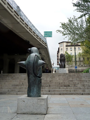
Walking just a little farther North on Calle Serrano will take you to a fascinating open-air sculpture museum, Museo de la Escultura Abstracta, located underneath the overpass of Paseo de Eduardo Dato. There are 17 abstract sculptures here including works by Joan Miró, Eduardo Chillida, and Alberto Sánchez. My favorite one is the giant concrete block suspended in mid-air by cables hanging from the bridge. It looks like it could have been made by the engineers of the bridge, with the same materials and pragmatism, so well integrated into the environment that it would be easy to walk right by it. But then there's that moment you realize, no wait, why would they have put that here? That's art.


Possibly the most curious fact about this statue is that it's location is exactly 666 meters above sea level, interpreted by some as the number of the Anti-Christ.

It depicts Lucifer as a winged youth being dragged to the netherworld by a large seven-headed serpent entwined around his legs. It was inspired by John Milton's poem Paradise Lost: "...his pride had cast him out from Heaven, with all his host of rebel angels... round he throws his baleful eyes that witnessed huge affliction and dismay mixed with obdurate pride and steadfast hate". The symbolism of the statue is complicated because the Romans believed that Lucifer carried the light that could save humanity even though he was bound to his destiny, and also the serpent that entwines him may represent wisdom.


The pedestal was designed by José Urioste with eight gargoyle-like heads spouting water, and the statue was unveiled in its current location in 1885, undoubtedly becoming the talk of the town.
Walking along Calle Mayor you will come into view of another fallen angel statue, but this one is called Accidente Aereo, a sculpture by Miguel Ángel Ruiz in 2006. In the artist's words: "Ni Ícaro, ni el diablo. Es un aviador distraído". He describes it as a Being who has flown around the Peninsula for thousands of years and when he unexpectedly comes into contact with the high-rises of Madrid he crashes into one of them.


Moving on to non-angel related sights, strolling up Calle Serrano just North of Puerta de Alcalá will bring you face to face with gigantic monuments dedicated to the discovery of America. This is Monumento de Descrubrimiento, erected in 1970, and is adjacent to Plaza de Colón (which has a great statue of Christopher Columbus in the center of the rotary) and the Archaeological Museum (still not open because of remodeling, but it's anticipated to be one of the best museums in Madrid once it opens it's doors again). Also, the garden next to the monument has the most gigantic Spanish flag on earth.


Walking just a little farther North on Calle Serrano will take you to a fascinating open-air sculpture museum, Museo de la Escultura Abstracta, located underneath the overpass of Paseo de Eduardo Dato. There are 17 abstract sculptures here including works by Joan Miró, Eduardo Chillida, and Alberto Sánchez. My favorite one is the giant concrete block suspended in mid-air by cables hanging from the bridge. It looks like it could have been made by the engineers of the bridge, with the same materials and pragmatism, so well integrated into the environment that it would be easy to walk right by it. But then there's that moment you realize, no wait, why would they have put that here? That's art.


 |
| Eduardo Chillida |

Subscribe to:
Posts (Atom)